Edit package
Overview
Edit is the subpackage located under packages/edit exposing Vue 3 components. It is used by the Content Element authors to create a Content Element. It consists of three main components:
- Edit component; main authoring component, required
- Top Toolbar component; exposing Content Element controls within the Tailor CMS top toolbar slot; optional
- Side Toolbar component; exposing Content Element controls within the Tailor CMS side toolbar slot; optional
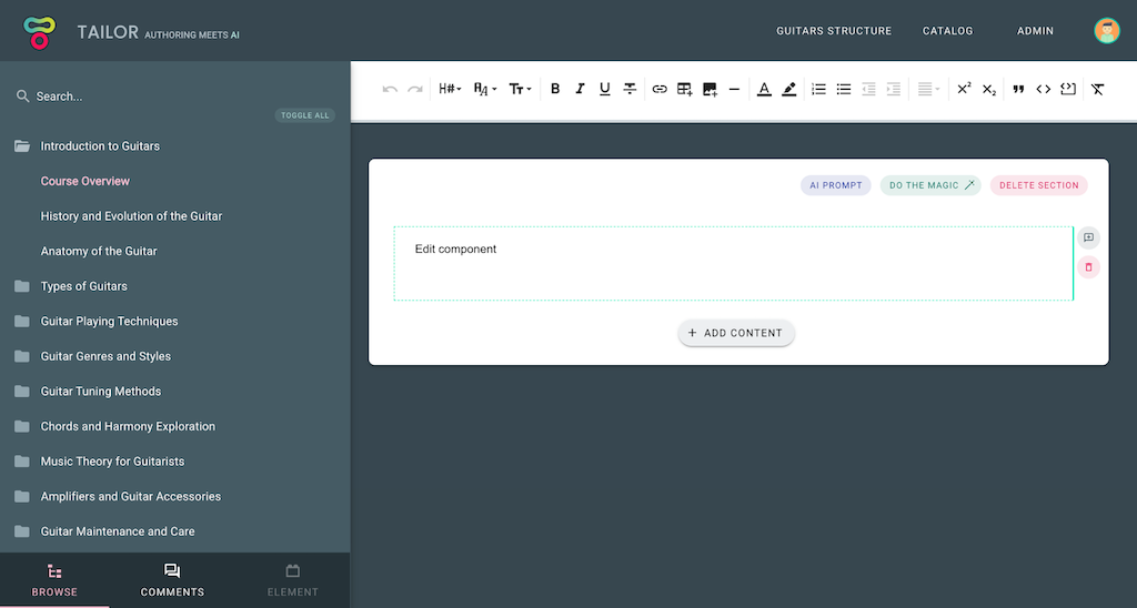
In the example image below, you can see a WYSIWYG editor Edit component (displaying 'Edit component' text) and its Top Toolbar; exposing various editor controls (mounted below the main application heading). Side Toolbar is not exposed for this Content Element; in case if it was, it would be visible upon element selection instead of Browse sidebar (note that element tab in the bottom left corner is greyed out).
These are regular Vue components which are being passed element related props:
:element: object; Element entity containing all element related data:isFocused: boolean; Is element selected:isDragged: boolean; Is element being dragged; e.g. upon reordering:isReadonly: boolean; Should element be readonly; e.g. upon copy element selection
and observed for element related events:
@save- Emitdataobject to be saved on theelement.dataproperty (non-question elements).@update- Emit partial data to be merged into element state (question elements only — the QuestionCard wrapper handles persistence).@delete- Delete element (default control already exists)@link- Open the element linking dialog (see Linking elements)
As noted above, to store element state, simply emit save event passing an object to store (which will be persisted on the element.data property). To set the initial state of the element.data property, you need to define the initState function. The initState function generates the initial element.data value. For more details on how to do that, please visit the State section.
Here is an example of a simple counter Edit component from the Introduction section:
Edit.vue
<template>
  <div>
    <div>Times clicked: {{ element.data.count }}</div>
    <button @click="increment">Increment</button>
  </div>
</template>

<script setup lang="ts">
import { Element, ElementData } from 'tce-manifest';

const props = defineProps<{ element: Element }>();
const emit = defineEmits<{ save: [data: ElementData] }>();

const increment = () => {
  const { data } = props.element;
  const count = data.count + 1;
  emit('save', { ...data, count });
};
</script>
In the example above, component triggers save state event on each Increment button click. Note how data object is recreated, rather than count value being modified. Since data flow should be top-down it is important not to modify the received value, but rather emit a new state (to avoid side-effects). After the event has been triggered, change is received via prop (updated element state). Similar goes for the TopToolbar:
TopToolbar.vue
<template>
  <button @click="decrement">Decrement</button>
</template>

<script setup lang="ts">
import { Element, ElementData } from 'tce-manifest';

const props = defineProps<{ element: Element }>();
const emit = defineEmits<{ save: [data: ElementData] }>();

const decrement = () => {
  const { data } = props.element;
  const count = data.count - 1;
  emit('save', { ...data, count });
};
</script>
Communication between components
Info
Available in version >=0.1.0
All authoring components have the $elementBus pub/sub mechanism available, provided via Vue provide/inject feature. To communicate between components, simply inject $elementBus and emit the event.
TopToolbar.vue
<script setup lang="ts">
...
const elementBus = inject('$elementBus');

const decrement = () => {
  // Emit decrement event upon toolbar btn click
  elementBus.emit('decrement', { count });
};
...
</script>
Proceed by implementing a listener within the targeted component (using the on registration method):
Edit.vue
<script setup lang="ts">
...
const elementBus = inject('$elementBus');
elementBus.on('decrement', ({ count }) => console.log(count));
...
</script>
For more details on the entire pub/sub API see the vue-radio implementation.
Calling server procedures
All authoring components (Edit, TopToolbar, SideToolbar) can call custom server-side methods defined in the server package via the injected $rpc function.
<script setup lang="ts">
import type { RpcCaller } from '@tailor-cms/cek-common';

const rpc = inject('$rpc') as RpcCaller;

const generateSummary = async () => {
  // Type the return value via generic
  const result = await rpc<{ summary: string }>('generateSummary', {
    prompt: 'Summarize this content',
  });
  console.log(result.summary);
};
</script>
The RpcCaller type is exported from @tailor-cms/cek-common. Its signature is <T = any>(procedure: string, payload?: any) => Promise<T> — the generic T lets you type the return value at each call site. When omitted it defaults to any. The procedure parameter maps to a key in the server package's procedures export. For details on defining server procedures, see the Server package - Server procedures section.
Linking elements
Content elements can reference other elements through the linking mechanism. When the Edit component emits a link event, Tailor CMS opens an element picker dialog. The selected element's reference is stored on element.refs, and the full resolved element objects are passed via the references prop.
Emitting the link event
<template>
  <VBtn @click="emit('link')">Link element</VBtn>
  <div v-if="references?.linked?.length">
    Linked: {{ references.linked[0].data }}
  </div>
</template>

<script setup lang="ts">
import type { ElementReferences } from '@tailor-cms/cek-common';
import { Element, ElementData } from 'tce-manifest';

defineProps<{
  element: Element;
  references?: ElementReferences;
}>();
const emit = defineEmits<{
  save: [data: ElementData];
  link: [key?: string];
}>();
</script>
The references prop uses the ElementReferences type (Record<string, Partial<Element>[]>) keyed by the reference name (e.g. linked). Each value is an array of element objects resolved from the lightweight identifiers stored in element.refs.
CEK runtime behavior
In the CEK development environment, emitting link opens an informational dialog and immediately:
- Updates
element.refson the server with mock reference data ({ id, outlineId, containerId }) - Passes a mock element via the
referencesprop
By default, the mock element is auto-generated from initState. To provide custom mock data, define mocks.referencesData in the manifest — only the data is needed, the runtime fills in id, type, etc.:
export const mocks = {
  displayContexts: [...],
  referencesData: {
    linked: [{ title: 'Mock linked element', prompt: 'Some prompt' }],
  },
};
This lets you develop and test linking UX without running Tailor CMS.
When to save the state?
Depending on the type of the element, you might wonder what is the best moment to persist element state. Most of the elements are observing isFocused prop and triggering save state event upon user focusing out of the element. Of course, this is not always possible, e.g. when element input needs to be validated. In those cases we suggest explicit save button.
Readonly state
Each Content Element needs to implement the readonly behaviour which is activated when isReadonly prop is set to true. Readonly element presentation is used for various features like observing Content Element diff or for copy functionality (Content Element needs to be previewed in order to be selected).
Composite Elements
Content elements can be configured as composite elements using the isComposite flag in the manifest. To include a list of embedded child elements, utilize the TailorEmbeddedContainer global component. Tailor CMS will render the appropriate element list, while the CEK runtime will mock example elements.
See the Global Components page for full props, events, and usage examples.
Question Elements
Content elements can be configured as question elements using the isQuestion flag in the manifest. Question elements require isComposite: true as well, because the question prompt uses TailorEmbeddedContainer under the hood.
CEK runtime: QuestionCard
When isQuestion is set, the CEK runtime wraps the Edit component in a QuestionCard — a card UI with a type/icon header, form validation, dirty tracking, and Save/Cancel controls.
The QuestionCard accepts an autosave prop (defaults to false for question elements):
autosave: false: Shows Save/Cancel buttons when the element has unsaved changes. The form is validated on submit.autosave: true: Changes are persisted immediately on every@updatereceived. The form validates on input. No Save/Cancel buttons are shown.
The autosave toggle is available in the Settings panel for question elements.
Unlike regular elements (where @save emits the full data object and persists immediately), Edit components inside QuestionCard emit @update with partial data (only the changed fields). The QuestionCard merges the update into its local state and handles persistence via Save/Cancel controls (or immediately when autosave is enabled).
<script setup lang="ts">
const emit = defineEmits<{ update: [data: Partial<ElementData>] }>();

// Emit only changed fields (QuestionCard merges them)
emit('update', { answer: newValue });
</script>
QuestionForm (auto-wrapped)
When isQuestion: true, the framework automatically wraps the Edit component inside a QuestionForm — providing the standard question layout:
- Question prompt — embedded container for question content
- Answer UI — the developer's Edit component (rendered in the default slot)
- Hint — optional hint text field
- Feedback — per-answer feedback fields (controlled by
showFeedbackmanifest field)
The developer's Edit component only needs to render the answer-specific UI. There is no need to import or use QuestionForm manually — the framework handles the prompt, hint, and feedback sections.
<template>
  <!-- Just the answer UI — prompt, hint, feedback are auto-wrapped -->
  <div>
    <VRadioGroup
      :model-value="element.data.correct"
      @update:model-value="emit('update', { correct: $event })"
    >
      <VRadio
        v-for="(answer, i) in element.data.answers"
        :key="i"
        :label="answer"
        :value="i"
      />
    </VRadioGroup>
  </div>
</template>

<script setup lang="ts">
const props = defineProps<{ element: any; isFocused: boolean; isReadonly: boolean }>();
const emit = defineEmits<{ update: [data: Partial<ElementData>] }>();
</script>
To control whether the feedback section is rendered, set showFeedback in the manifest (defaults to true):
const manifest: ElementManifest = {
  // ...
  isQuestion: true,
  isComposite: true,
  showFeedback: false, // Hide feedback section
};
Question element state shape
Question elements follow a specific data structure:
interface QuestionElementData {
  // Array of embed IDs that form the question prompt
  question: string[];
  // Key-value map of embedded elements (prompt parts, answer options, etc.)
  embeds: Record<string, ContentElement>;
  // Whether this question is gradable (has correct answers)
  isGradable: boolean;
  // Correct answer data (shape varies by question type, present when isGradable)
  correct?: any;
  // ... additional type-specific fields
}
isGradable behavior
The isGradable flag controls whether a question element tracks correct answers:
- When
isGradable: true— the element includes acorrectfield in its data and the Edit UI shows answer correctness controls - When
isGradable: false— thecorrectfield is removed and the element functions as a survey/poll question without grading - The flag can be toggled at runtime via the Settings panel in the CEK, or via the element configuration in Tailor CMS. Toggling resets the element data to
initStatewith the newisGradablevalue.