Example
Introduction
The goal of this section is to give a hands-on example on how to create a simple content element. We'll be creating a simple counter, with a bit of a twist to demonstrate the server side hooks.
Make sure you install prerequisites first!
For more details visit the Installation section.
Let's start by initializing a new project:
npx @tailor-cms/tce-templatename it tce-counter and follow the instructions.
cd tce-counter
pnpm dev
your browser should pop up and display the preview.
Content Element manifest
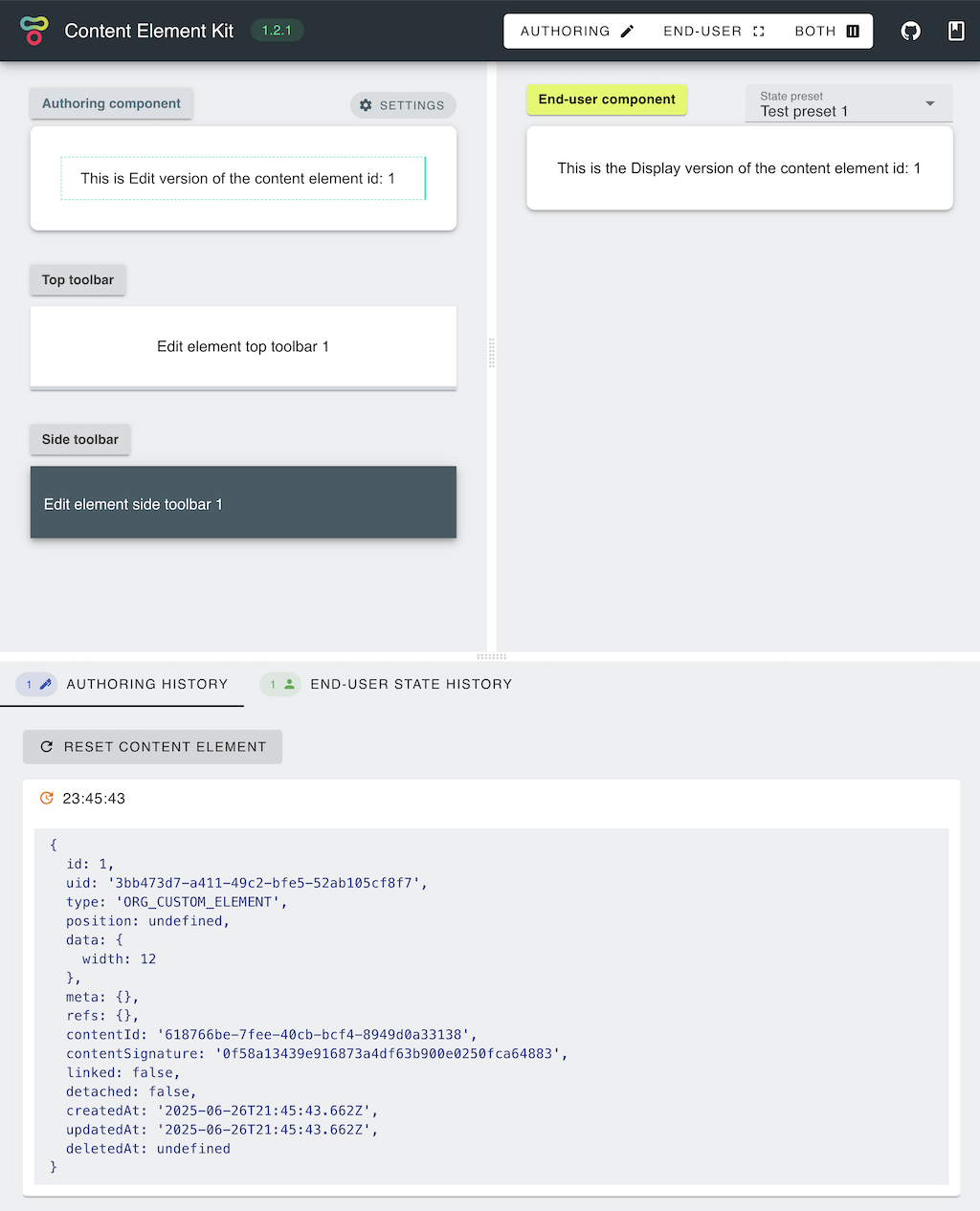
Let's continue by editing Content Element manifest; defining basic properties like name and type. In your editor of choice, open packages/manifest/src/index.ts and modify name and type properties:
// Element unique id within the target system (e.g. Tailor)
export const type = 'ACME_TCE_COUNTER';

// Display name (e.g. shown to the author within add element dialog)
export const name = 'Simple counter';
There is also an initState function, which as name implies, initializes state of the element upon creation. Since we are building a simple increment element, we'll define it as:
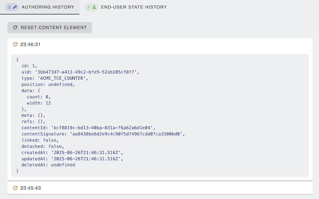
export const initState: DataInitializer = (_config) => ({ count: 0 });We also want to update the type definitions, to do so, open packages/manifest/src/interfaces.ts and update ElementData interface:
export interface ElementData extends common.ElementConfig {
  count: number;
}
Upon starting the runtime, the server state should now reflect these changes by displaying updated type and setting the data.count value to 0:
Edit component
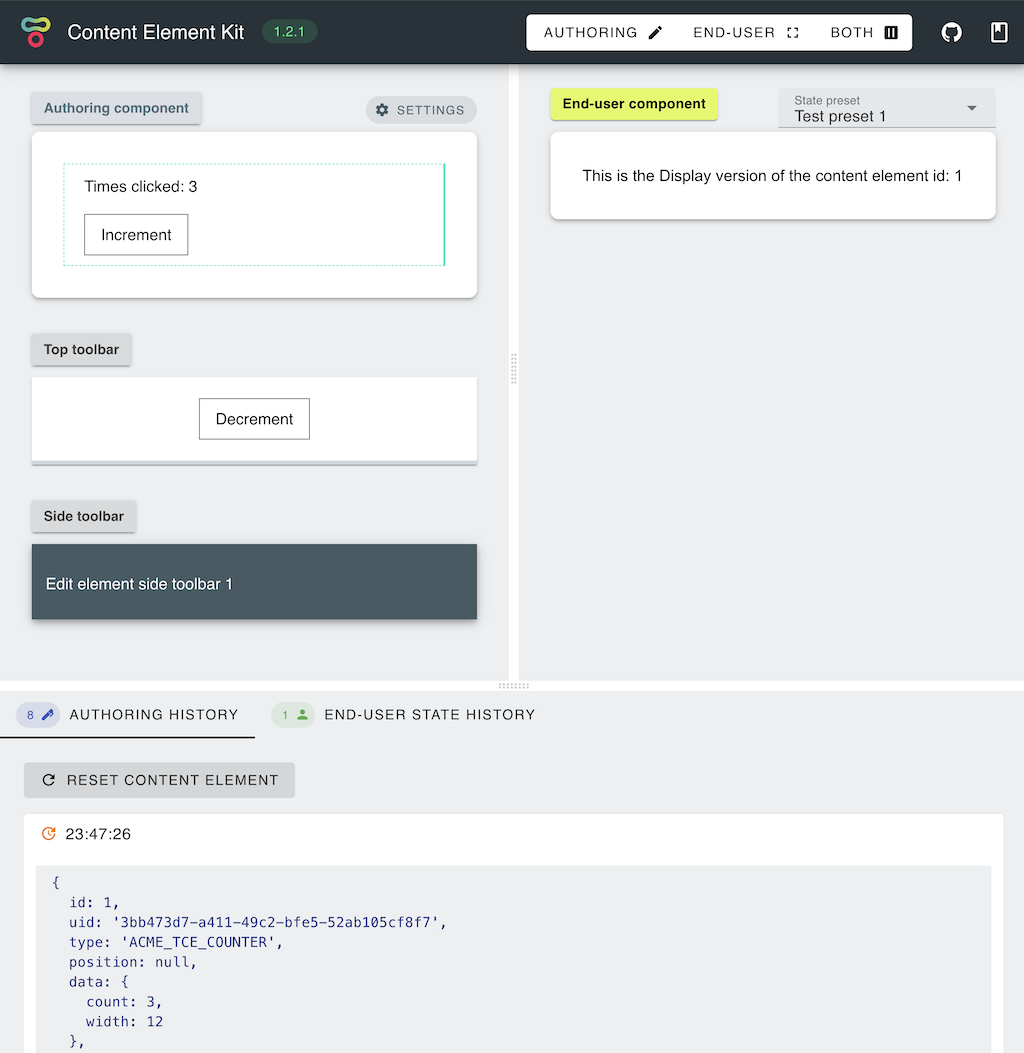
Now that we set the basic properties and specified how to initialize the component state, we can create Authoring component for our counter. It is not going to be the world's most complex or useful component; Author will have an option to click on a button, each time incrementing a counter. Navigate to packages/edit/src/components/Edit.vue and paste the following code for our simple counter:
<template>
  <div class="tce-container">
    <div>Times clicked: {{ element.data.count }}</div>
    <button @click="increment">Increment</button>
  </div>
</template>

<script lang="ts" setup>
import { Element, ElementData } from 'tce-manifest';

const props = defineProps<{
  element: Element;
  isDragged: boolean;
  isFocused: boolean;
  isReadonly: boolean;
}>();
const emit = defineEmits<{ save: [data: ElementData] }>();

const increment = () => {
  const { data } = props.element;
  const count = data.count + 1;
  emit('save', { ...data, count });
};
</script>

<style scoped>
button {
  margin-top: 1rem;
  padding: 0.5rem 1rem;
  border: 1px solid #444;
  background-color: #fff;
}
</style>
Note ☝️
We imported type definitions from the manifest package to enable code completion and to specify input.
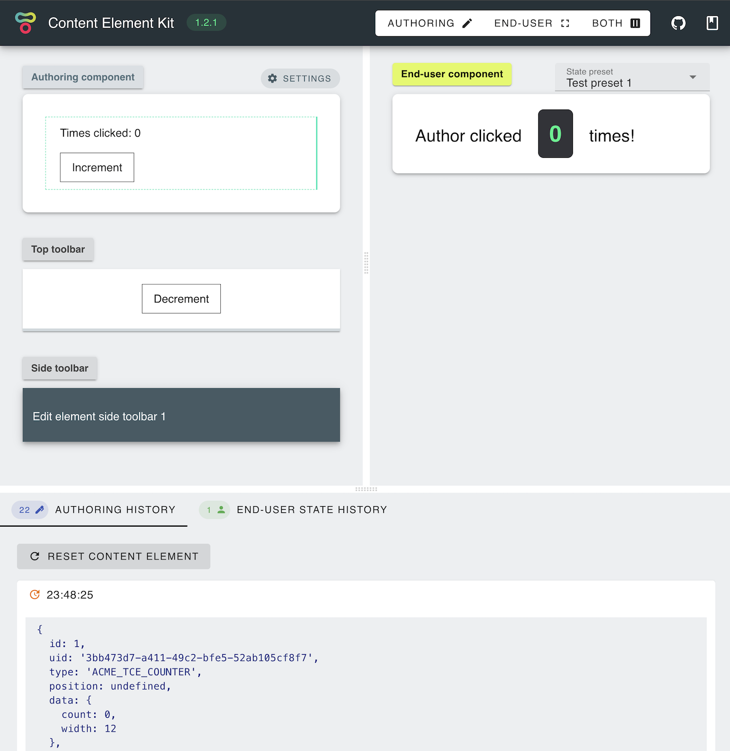
You should be able to see our Edit component and click on the Increment button. As you are clicking on the Increment button, you should see both; the front-end component and the server state being modified to the same value (as upon emitting the save event, data is being passed to the server runtime).

Edit toolbar
We can implement the same functionality from the toolbars, as they will also receive element state and have the ability to save it.
Navigate to packages/edit/src/components/TopToolbar.vue, paste the following code and save:
<template>
  <button @click="decrement">Decrement</button>
</template>

<script setup lang="ts">
import { Element, ElementData } from 'tce-manifest';

const props = defineProps<{ element: Element }>();
const emit = defineEmits<{ save: [data: ElementData] }>();

const decrement = () => {
  const { data } = props.element;
  const count = data.count - 1;
  emit('save', { ...data, count });
};
</script>

<style scoped>
button {
  padding: 0.5rem 1rem;
  border: 1px solid #444;
  background-color: #fff;
}
</style>
You should be able to decrement the count by clicking on the Top Toolbar Decrement button.
Display component
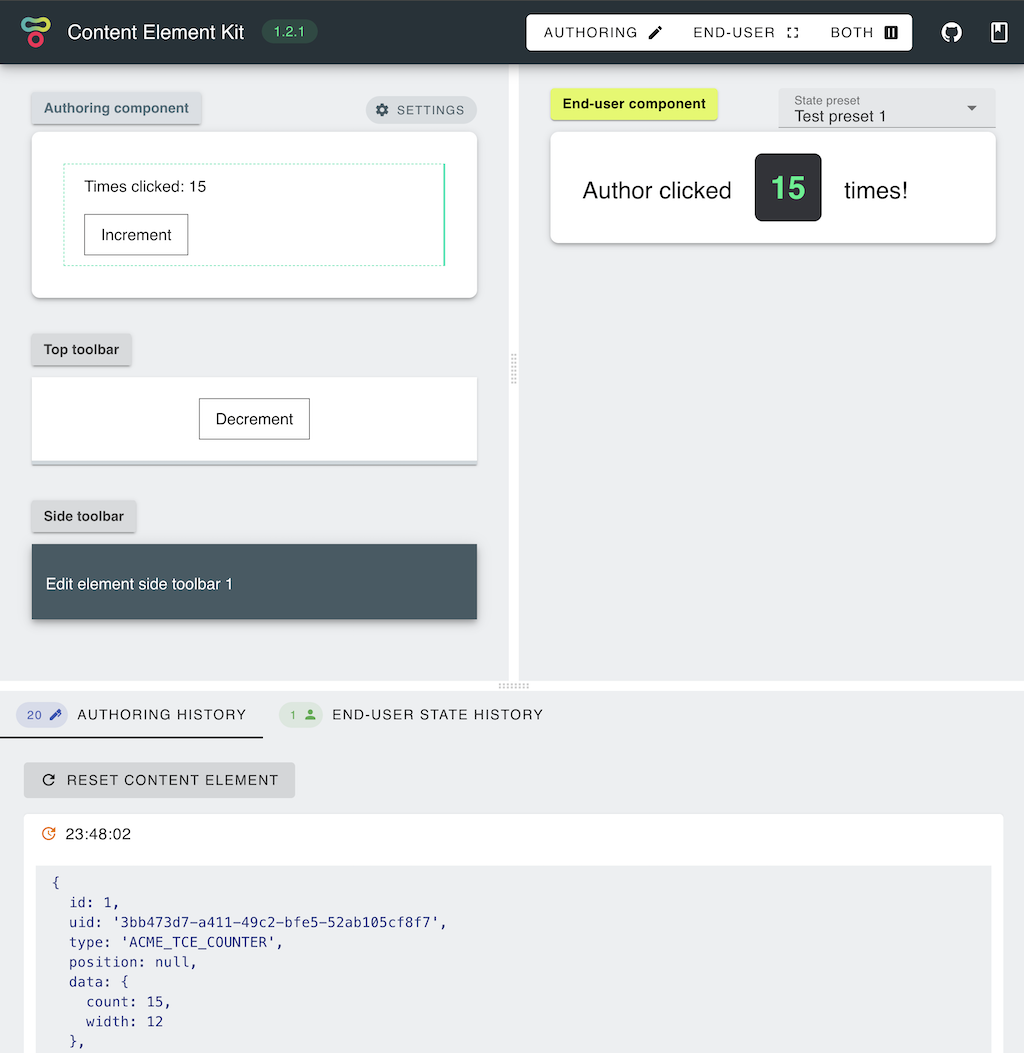
Now that we created an Edit component, we can create our End-user facing presentation component. For this particular example, Display component does not contain any additional logic, it simply displays our counter value. Navigate to packages/display/src/components/Display.vue and paste the following code:
<template>
  <div class="tce-root">
    Author clicked
    <span class="counter">{{ element.data.count }}</span>
    times!
  </div>
</template>

<script setup lang="ts">
import { Element, ElementData } from 'tce-manifest';

defineProps<{ element: Element }>();
</script>

<style scoped>
.tce-root {
  font-size: 1.5rem;
}

.counter {
  margin: 0 1rem;
  padding: 1rem;
  color: #23f48b;
  font-size: 2rem;
  font-weight: bold;
  background-color: #323338;
  border-radius: 0.5rem;
}
</style>
Note that Display component receives element attributes as props. After applying these changes you should be able to see the Display component:
Server hooks
Finally, we are going to make one last change to our might counter and add some server-side behaviour. Server hooks are great place for interfacing with external APIs (e.g. create a video upload link), validating inputs, handling secrets and preparing the data for delivery (e.g. signing assets to enable access).
In this example, we are going to reset the counter in case it reaches 10.
Navigate to the packages/server/src/index.ts and update the beforeSave hook to:
import type { ElementHook } from '@tailor-cms/cek-common';
import type { Element } from 'tce-manifest';

export const beforeSave: ElementHook<Element> = (element) => {
  if (element.data.count >= 10) {
    element.data = {
      ...element.data,
      count: 0,
    };
  }
  return element;
};
Now after clicking on increment (or decrement) button again beforeSave hook resets the count:
Element is a Sequelize.js instance, with data defined as a JSONB property. In order for Sequelize to detect changes, data property is entirely replaced with a new value.
Note ☝️
In case that hook code changes are not picked up automatically, please restart.
Conclusion
Congratulations! You have created your first Content Element. For more details on each of the components please visit the matching documentation section. For a fully working example, please visit https://github.com/tailor-cms/tce-counter.